
When looking through scientific papers, it’s common to see colorful results. Although aesthetically pleasing to some, these results can be difficult to interpret for engineers with color vision deficiency (CVD). You may think that presenting results in grayscale could help, but humans are less able to discern between different shades of gray. So what’s the best option here?
The Effect of Color Vision Deficiency on Simulation and Engineering
As children, many of us took eye examinations to determine if we had CVD. These tests can involve showing the subjects pseudoisochromatic plates, which are circles made up of dots of different colors and sizes. The ability to differentiate between the dots and see a number in the middle of the plate indicates that a person does not have CVD.
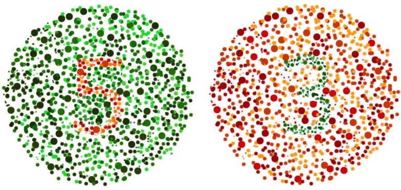
An illustrative example of a color vision test. The numbers included are 5 and 3.
However, for the 1 in 12 men and 1 in 200 women with CVD, these symbols are hidden in a colorful camouflage. This is because CVD makes it difficult to distinguish between particular colors.
In the scientific community, this poses a problem because color tables are often used to help visualize results and present data in a way that is meant to be easily understood. To do so, color tables use arrays of colors in a predefined order, with each color representing a different value. Some color tables, such as rainbow (the default color table in many different software), use a wide range of colors. For engineers with CVD, the colors used in these tables can cause data misinterpretations, possibly obscuring key results and findings.
For example, take a look at the images below. These show that results visualized with a rainbow color table (left) can appear completely different to a person with CVD (middle). In this case, which simulates red-green CVD or deuteranopia, the bright red from the rainbow color table would be interpreted as a darker gray-yellow by engineers with CVD, which could result in data misinterpretation. One solution to this problem would be to generate a new color table so that the results can be interpreted correctly by engineers with CVD (right).
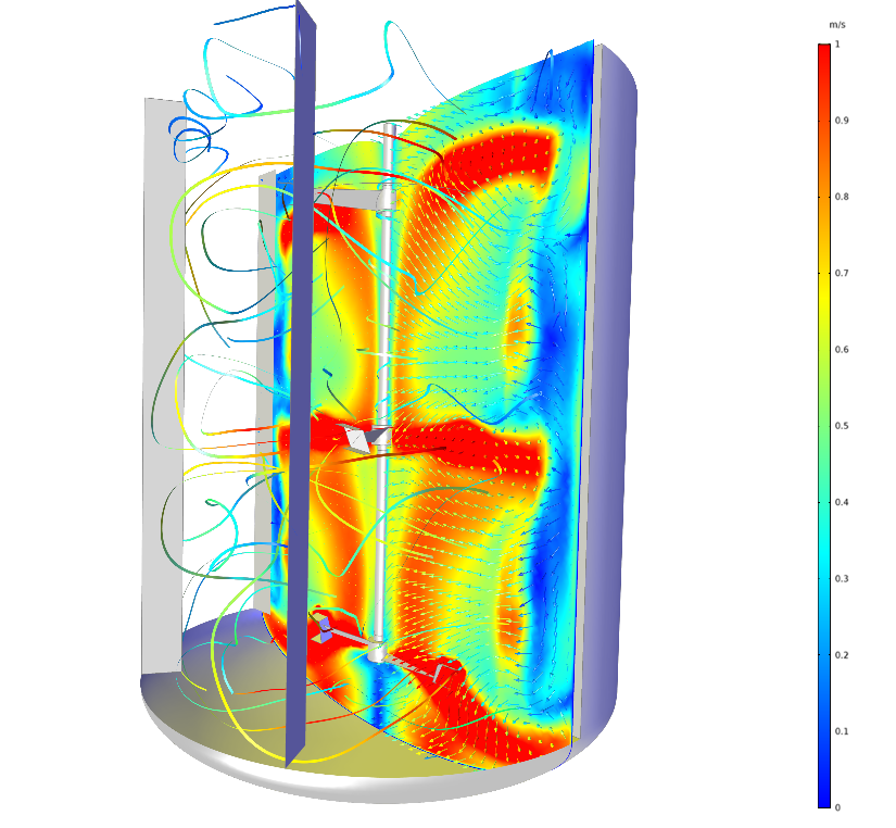
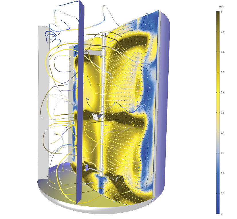
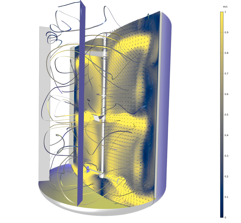
Different visualizations of a mixer model.
Rainbow color tables are not only problematic for people with CVD; they pose issues for people without CVD, too. Jamie Nuñez, one member of a research team from the Pacific Northwest National Laboratory (PNNL), explained that rainbow color tables introduce artifacts due to their uneven change between colors and their lack of a ramp in lightness (i.e., lightness steadily increases from one end of the color table to the other). This can cause the appearance of significant (or insignificant) regions when the opposite is true.
Nuñez also noted that although we can compare different regions by including a color table next to an image, unnecessarily complex color tables just slow down interpretation and can lead to incorrect conclusions.
In addition, despite the prevalence of tests for CVD, it is possible to have a CVD and be unaware of it. This happens because people learn what colors certain objects are supposed to be from an early age. And regardless of if someone is actually seeing the same color as another person, they will call it the same thing. This means that whether we know it or not, we may be incorrectly perceiving the colors used in the results of simulation and engineering projects.
Creating a Color Table While Keeping CVD in Mind
Due to these issues, Nuñez and her fellow PNNL researchers Dr. Ryan Renslow and Dr. Christopher Anderton came to a realization: There has long been a need to move away from rainbow color tables. Therefore, the team decided to make an optimized color table that could be used throughout the scientific community.
To create an optimized color table for engineers with CVD, one option is to use grayscale. However, presenting results as grayscale images comes with its own set of issues. Namely, people have more difficulty distinguishing between different shades of gray and are less able to observe subtle changes when these tables are used.
Instead, the PNNL team created Cividis, a color table that is optimized with CVDs in mind.
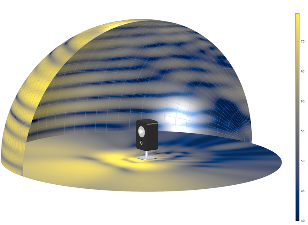
The Cividis color table helps people with CVD accurately interpret simulation results, such as the sound pressure level of this loudspeaker.
Revealing the True Colors of Your Simulation Results with Cividis, an Optimized Color Table
For the PNNL team, the underlying goal of Cividis was to create a color table that optimizes the viewing of scalar data for people with and without CVD. In essence, the color table should have the highest accurate representation of data for the maximum number of people possible.
Achieving these goals wasn’t easy, as the team had to develop code to optimize color tables, which Nuñez mentioned was their greatest challenge. While the team knew its goals and the steps involved, actually understanding how to accomplish them without having to manually tweak anything was challenging. In addition, gathering and interpreting relevant color theory information took quite a bit of work.
In the end, the team overcame these challenges and created Cividis by optimizing the Viridis color table, which is seen as the current gold standard of color tables, but is not optimized for those with CVD. Cividis includes various shades of blue and yellow to create a user-friendly color table for people with and without CVD. What’s more, the PNNL team decided to share Cividis with COMSOL so that users of the COMSOL Multiphysics® software can easily access it for their own simulations. This color table is now available as of version 5.3a of COMSOL Multiphysics.
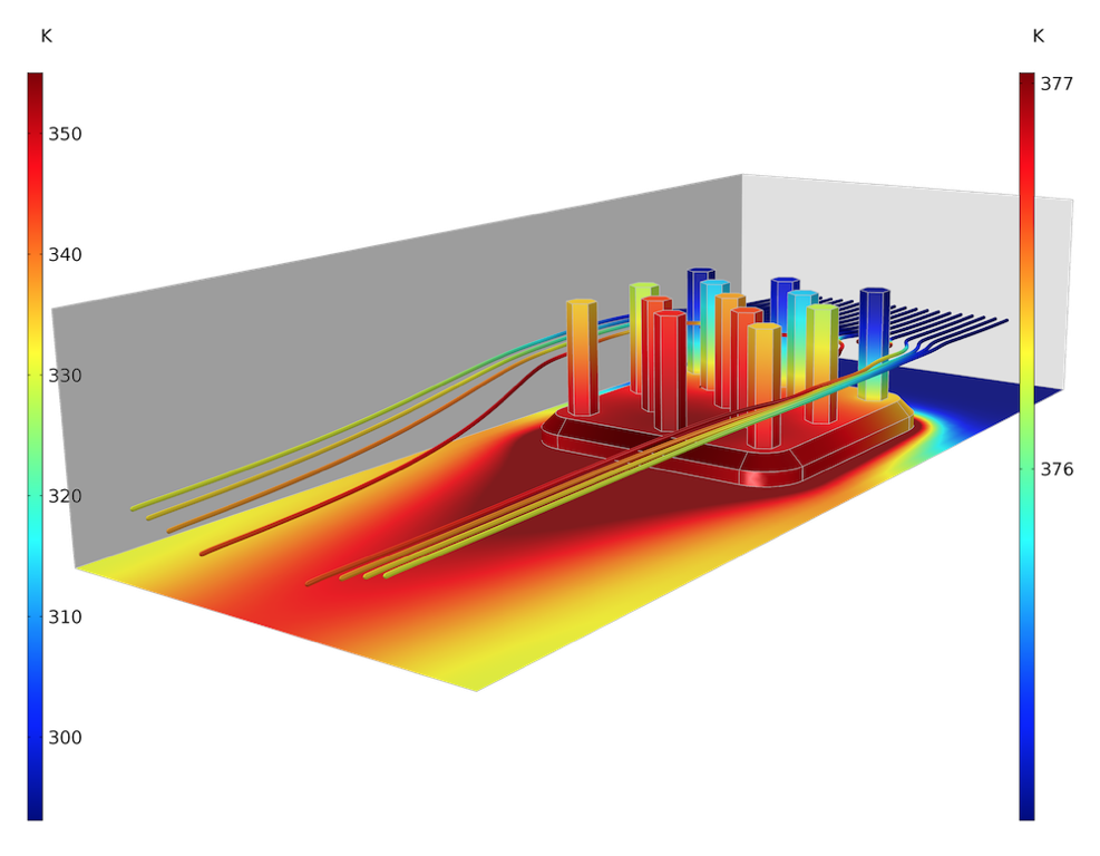
The temperature profile in a heat sink (right color legend) and in the air around the heat sink (left color legend). This model was visualized using a rainbow color table.
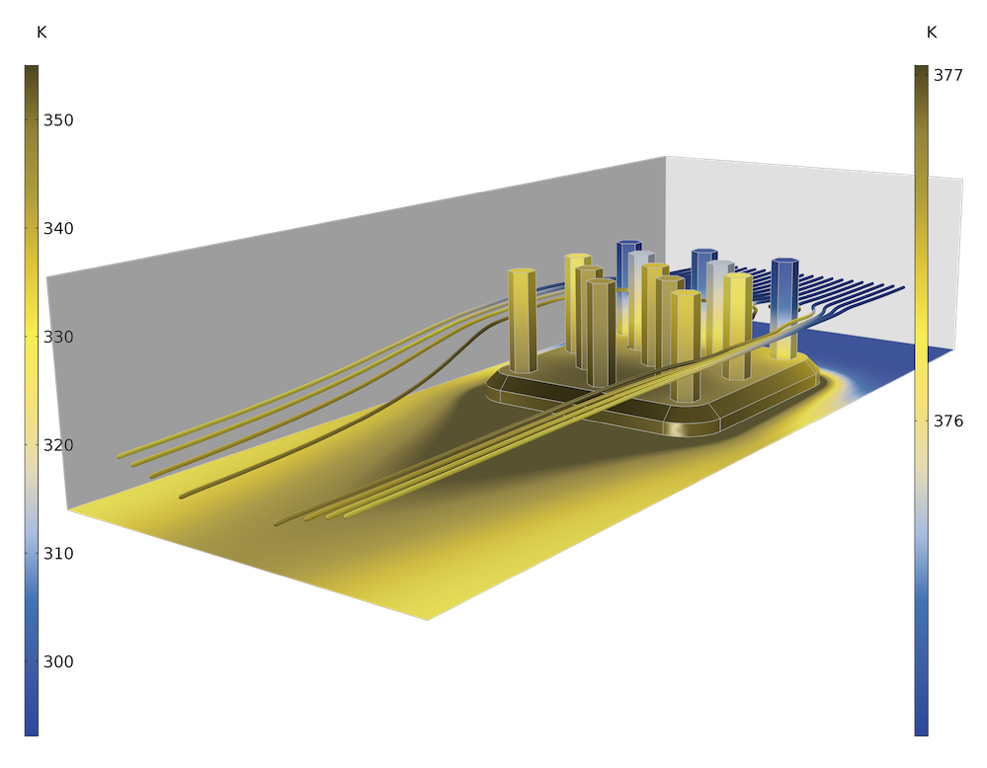
This image depicts how people with deuteranopia perceive the rainbow color table results.
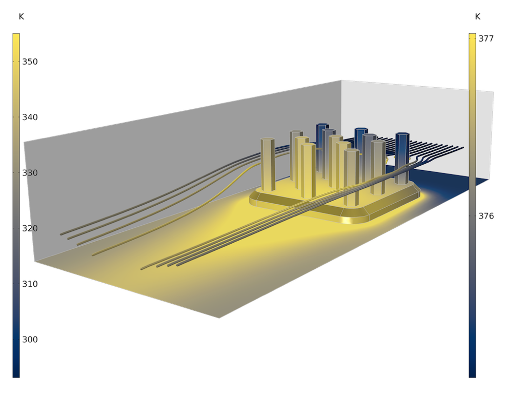
In this version of the model, the results are visualized using the Cividis color table. By swapping out the rainbow color table (top) for Cividis, engineers with CVD can more easily analyze the temperature field and avoid potential data interpretation artifacts.
Advantages of Cividis
According to the PNNL team, Cividis offers three primary advantages to users of COMSOL Multiphysics.
First of all, it provides a perceptually uniform change in color and constant ramp in lightness. This means that the colors in Cividis change smoothly over the color table, with brighter colors representing higher values and vice versa. This is beneficial, Nuñez explains, as Cividis is very intuitive for how the different colors within the color table compare to each other. That makes it easy for others to understand how different values in an image compare and allows truly significant regions to stand out.
Additionally, the wide range of colors used in Cividis prevents the issues that come with using a grayscale. Finally, although Cividis has been specifically tested for use with red-green color deficiencies, the most common CVD, it can be used by engineers with and without CVD. This is because Cividis looks the same to engineers with normal color vision, a deuteranomaly, or deuteranopia.
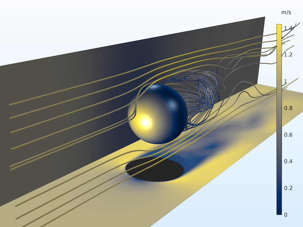
Using Cividis to model a Karman-vortex street behind a sphere subjected to a flow.
While we at COMSOL find the Cividis color scheme to be aesthetically pleasing (perhaps reminiscent of the colors of a moon-lit sky), some testers found the color table to be unattractive due to a lack of color changes. To tackle this issue, the PNNL team plans to use the tools they created to optimize Cividis and create another optimized color table that cycles through more colors while remaining optimal for varying severities of deuteranomaly…so, stay tuned!
Sharing Cividis with Those Who Need It
Moving forward, the team feels that in order for the scientific community as a whole to shift toward the use of optimized color tables such as Cividis, it needs to be easy to understand their importance and add them to software. This is why the PNNL team shared Cividis with COMSOL. They also plan on making all of their materials free and widely available. Nuñez says that their goal was to make this color table — along with the code used to generate it and the paper written discussing its design — available to everyone to help aid in the problem the team had identified.
Nuñez, Renslow, and Anderton hope that their work will increase the awareness and availability of CVD-friendly color tables, helping around 600 million people worldwide with CVD.
Suggested Reading
- The Cividis color table is described in the paper by J. Nuñez, C. Anderton, and R. Renslow: “Optimizing colormaps with consideration for color vision deficiency to enable accurate interpretation of scientific data,” 2018.


Comments (1)
Erik Hebestreit
April 1, 2020I appreciate that Comsol offers the Cividis color table. Is there a way to make Cividis the default color table for all new plots?